


Spring Style and Colour Trends by Neale Whitaker
It’s a bit like the chicken and the egg. Is Australian spring ahead of the curve or lagging behind it? I guess it depends where the curve starts. There was a time when style watchers lamented the fact that our great southern land was always a season behind Europe or the US, but these days it’s a different story. With a confident style that is uniquely ours, I believe Australian design sets its own agenda. We really don’t have to worry about being behind or ahead – we just are.
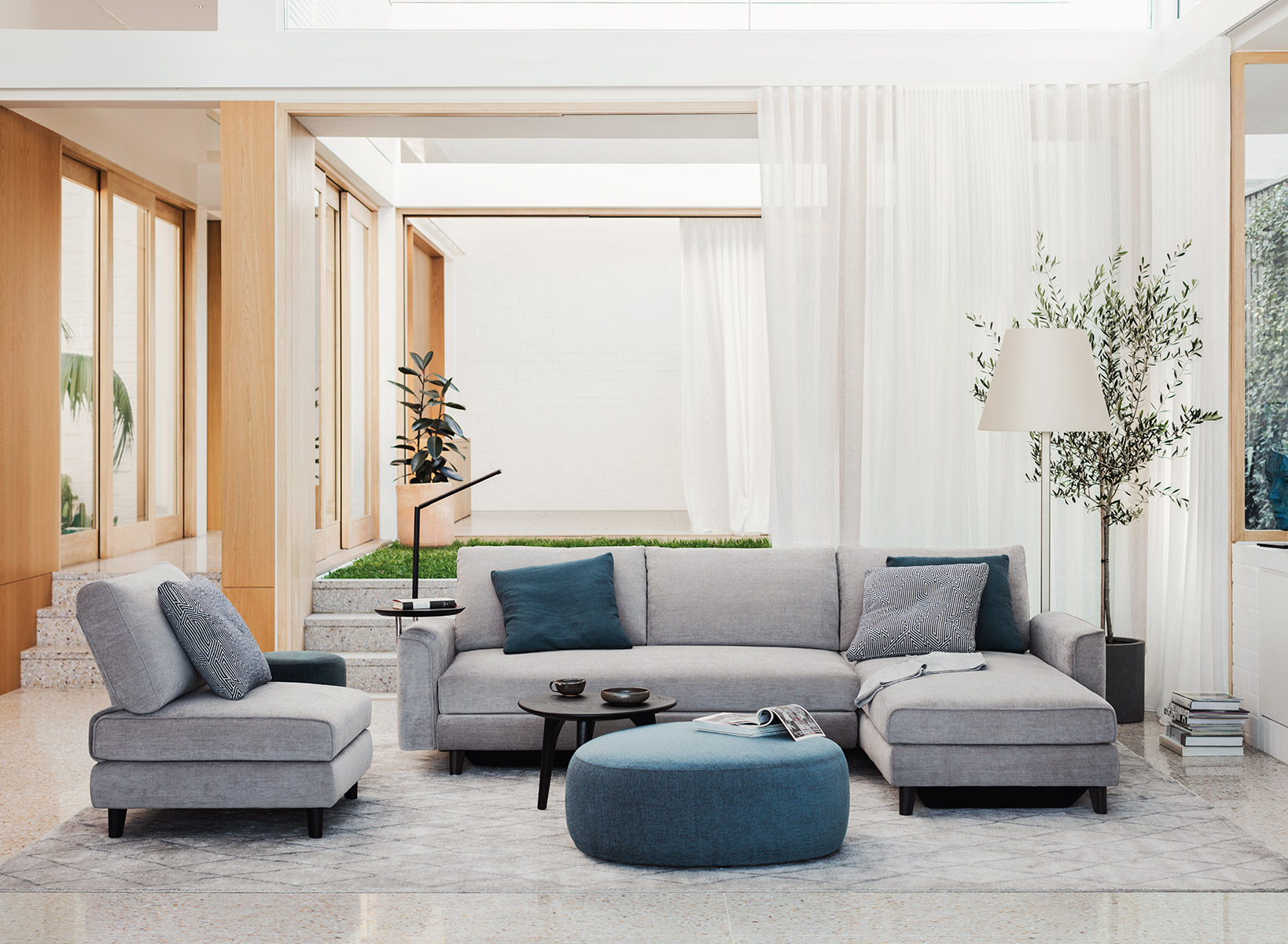
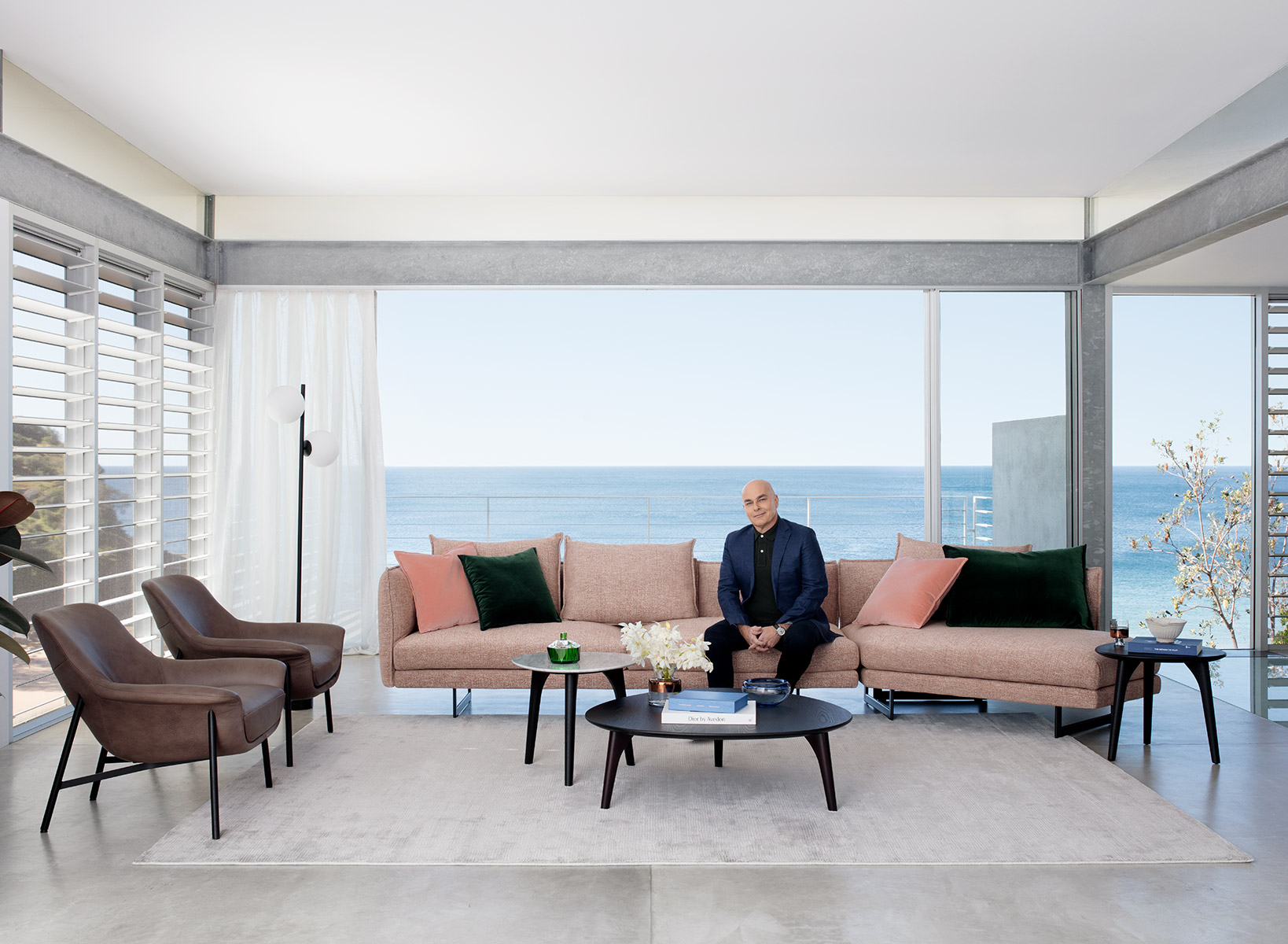
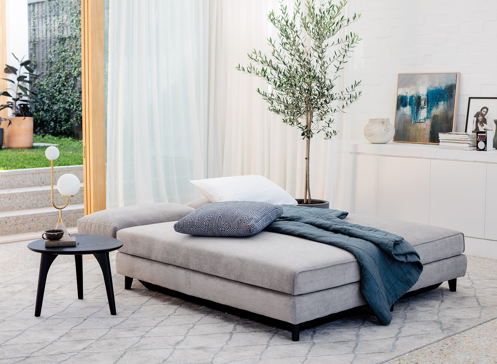
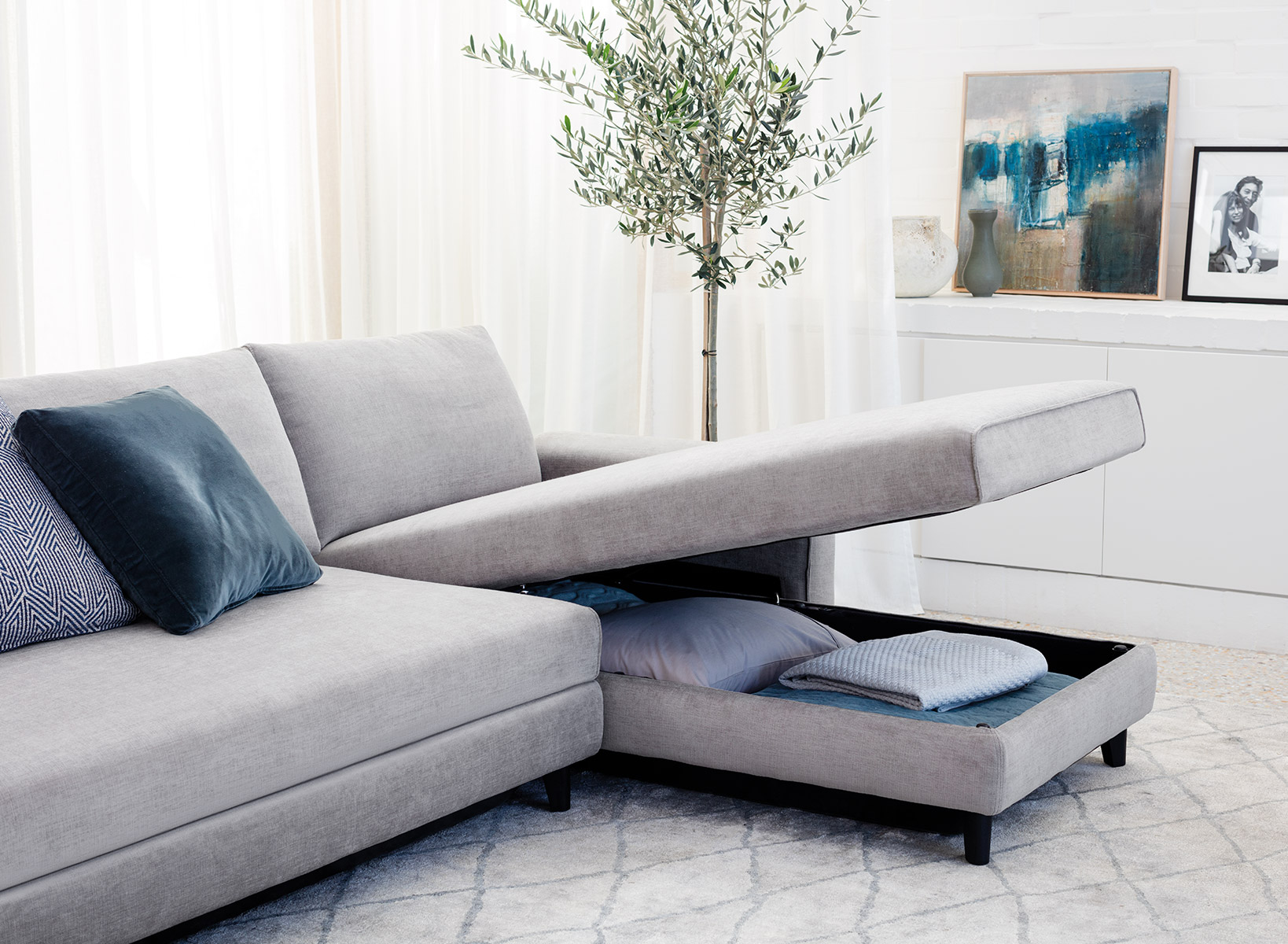
At King Living, spring 2018 celebrates the 20th birthday of the classic Delta sofa. It might seem unusual to reference a vintage piece - Delta was designed in 1998, which makes it vintage in my book - in the context of new trends, but the iconic sofa perfectly illustrates design’s current insistence on craftsmanship, quality, investment and longevity. And from a style perspective, its clean, timeless lines (the choice of fabrics available at King Living make Delta a true design chameleon) are the perfect backdrop to spring’s fresh new looks. By the way, the award-winning Delta was updated in 2017 and it’s never looked better.
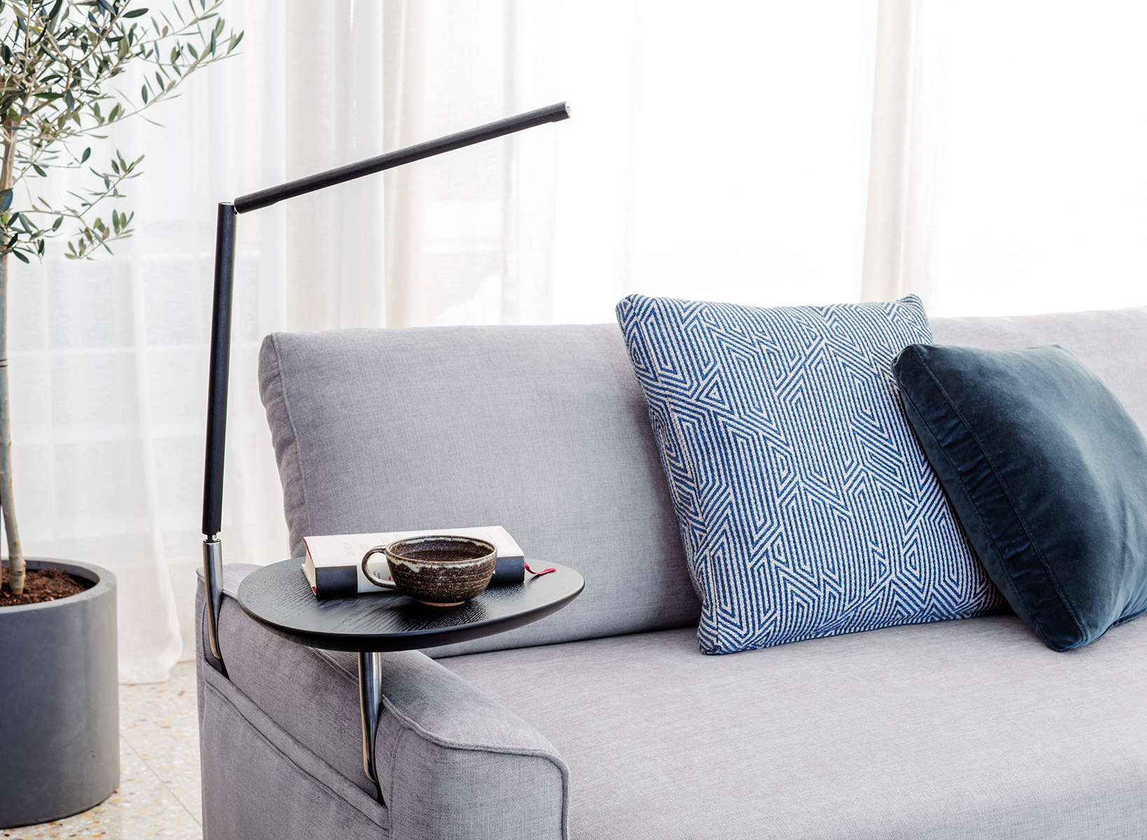
Spring interiors continue their romance with a rich, saturated colour palette, adding pale pastels and gelato shades to offset the intensity. Blues are still a popular choice, especially when used as decorative accents (such as Jeffrey Alan Marks’ new Oceanview fabrics at King Living). We haven’t seen so much red and yellow since the 1980s and yes, they’re even being put together. Dark timbers – for furniture, flooring and cabinetry – are a welcome alternative to the blonde, Scandi-inspired timbers of recent years. Think King Living’s Aspen range. ‘Maximalism’ is still a predominant force (minimalists will have to endure at least one more gruelling season), as evidenced by the sudden popularity of glass-fronted cabinets and open shelving in kitchens, laundries, bathrooms and living rooms. But that doesn’t give a green light to clutter. Instead, the look is more about thoughtful, curated collections of glassware, ceramics, books, linens and everything that can be described with one joyous word – tchotchkes. Somehow ‘knick-knacks’ doesn’t have quite the same ring.
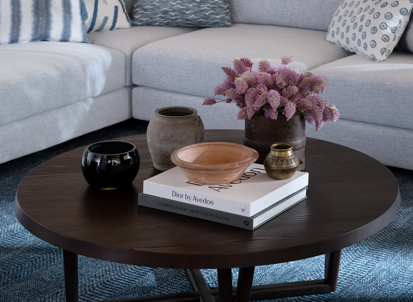
Terrazzo, especially in fresh new colour combinations, is a cool alternative to marble that continues to find its way to tiles, splashbacks, benchtops, furniture and accessories. The devil is very much in the decorative detail and those details include fringing and tassels on cushions, throws and bedlinen. Line drawings – especially abstract human faces – are ubiquitous in art and ceramics, and the Japanese concept of wabi-sabi can be seen in the raw textures of oversized woven basketry. And perhaps an antidote to our frenetic, info-heavy lifestyles, mindfulness and meditation have become popular adjuncts to the yoga phenomenon. In design terms, that translates as incense and oil burners in metal, stone and geometric shapes. Our chakras have never looked so stylish.

