


Neale Whitaker on living with colour
Until recently, if you flicked through the pages of any Australian home magazine you could be forgiven for thinking we’re a nation that loves any colour as long as it’s white. And while that might be a generalisation, there’s actually sound reason behind the affection.
Depending where you live on this vast continent, chances are that for much of the year you experience a warm climate and amazing light (as a Brit, I can vouch that Aussie greens are greener, blues bluer and reds redder than almost anywhere else on earth).
No wonder then that we’ve tended to favour a palette of cool neutrals. It makes sense when the colours outside are so brilliant, so intense. But something’s changing. Call it the zeitgeist, post-COVID euphoria or simply neutral fatigue, but we’re embracing more interior colour than we’ve done in years. And I’m not talking washed-out, post-millennial pinks or peppermints. I’m talking rich colour (deep blues, teals, greens, browns, plums and ochres), the like of which we haven’t seen since the Seventies.
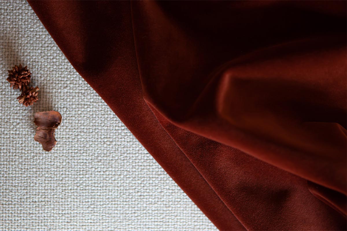
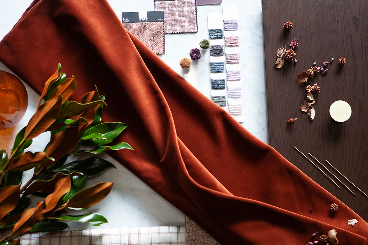 KING offers a range of premium fabrics. Pictured above is Preston Velvet fabric featured in Spice.
A little colour can go a long way
As some of you will know, I’m not a great believer in rules when it comes to interior design, but where colour’s involved - especially saturated colour - it’s wise to remember a little can go a long way.
Think of colour like spirits in a cocktail. Just a small measure will significantly impact the taste. In simple terms, colours express emotion. As a general rule, yellow stands for joy, blue for calm, orange for energy, red for passion - and so on. But remember that in certain cultures the interpretation is different. White, for example, can be the colour of mourning and red the colour of luck and fortune.
Think about why you love a particular colour and what emotion you want to convey. Consider too what we call the ‘colour wheel’ (there’s a wealth of information online) and the way in which colours are grouped as primary, secondary or tertiary. Complementary colours are those on opposite sides of the wheel that complement each other (like my favourite blue and orange), while analogous colours are those that sit together on the wheel - like red, orange and yellow.
Believe me, the more you study colour, the more fascinating it becomes. The 60/30/10 rule is also useful - that’s 60% neutral, 30% toning shades and 10% contrast. It can help to maintain balance in a room, especially when you’re introducing colour for the first time.
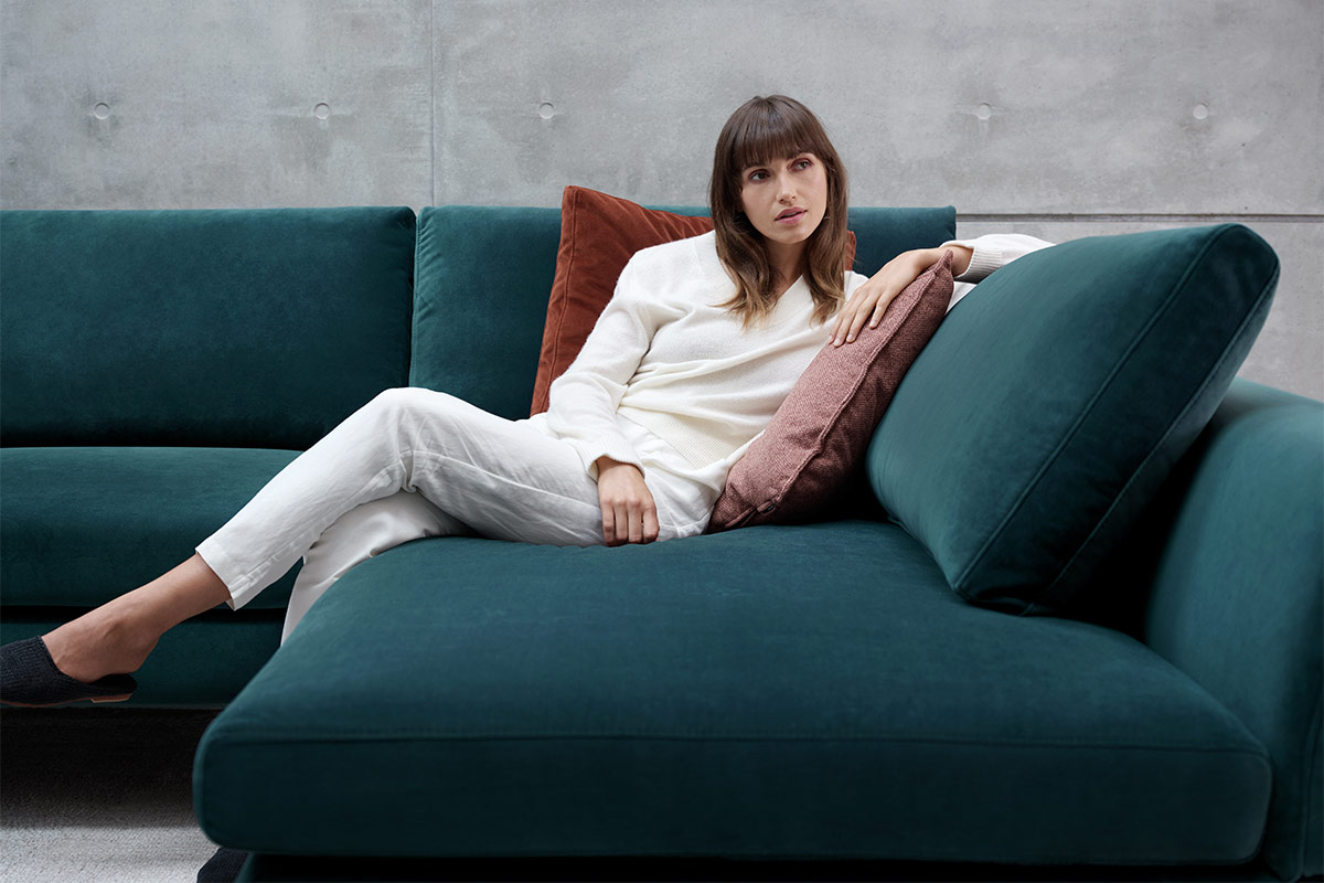 The KING Preston Velvet range launches in winter 2022. Pictured above in Aegean Teal.
Colour should bring joy
But with so-called ‘rules’ and technical terms, it’s little wonder many of us are still wary of colour. At the end of the day, colour should bring joy, not anxiety.
Sebastian Nash is KING’s Fabric Development Manager and, inspired by the popularity of colour with clients at KING’s recently-opened London store (rich colours are the perfect antidote to long British winters), he’s excited about launching KING’s new easy-care Preston Velvet range this winter in Australia. It’s a palette of 16 colours named for Australian painter and printmaker Margaret Preston. “This collection is for people who enjoy colour” Sebastian explains. “The texture of the velvet gives the colours a strong, saturated appearance that will bring luxury and drama into an interior setting.” Preston Velvet will be available as both a furnishing and accessories fabric.
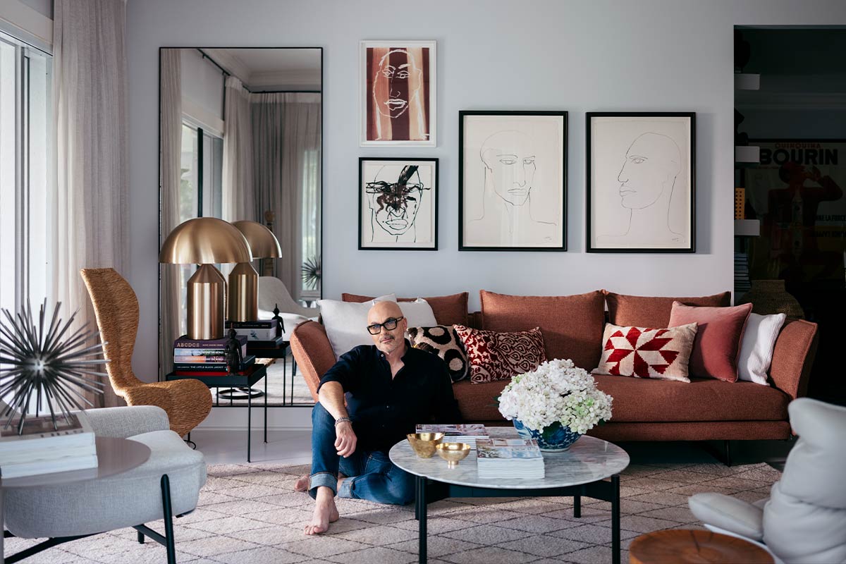
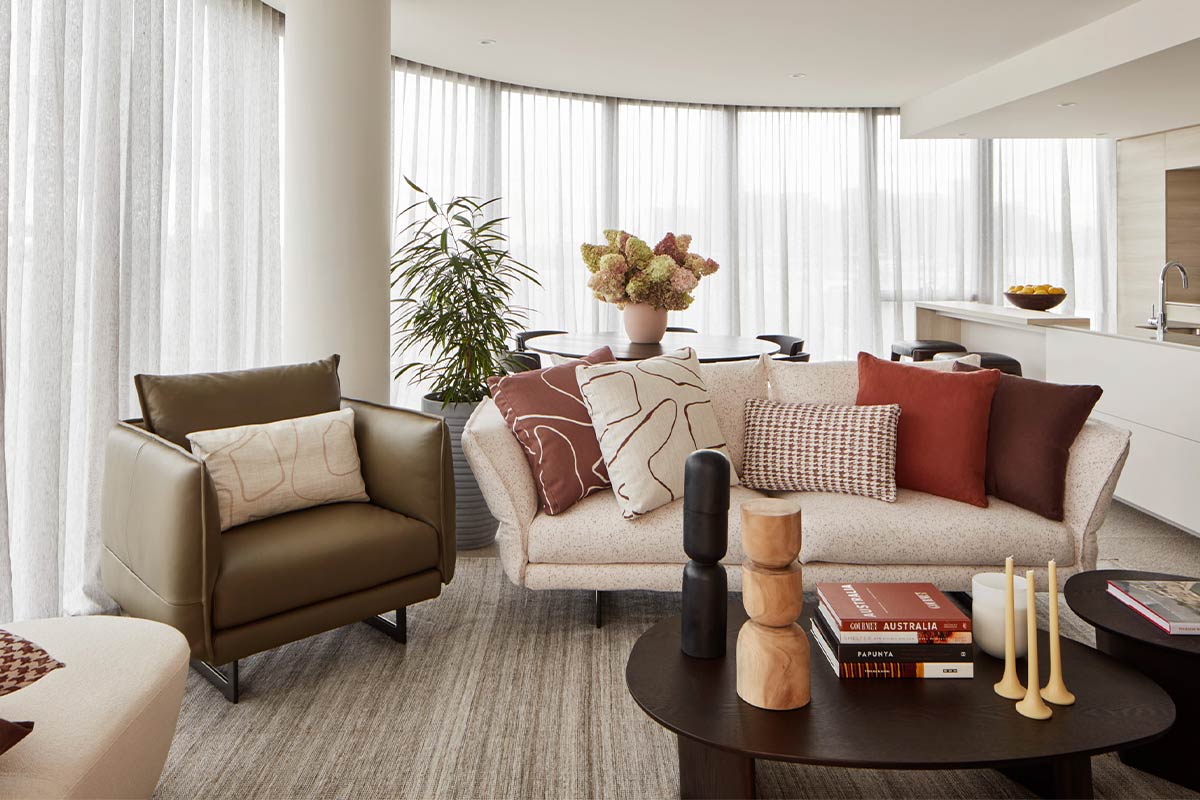 Neale opted for a palette inspired by the Australian landscape when styling ‘Destination Australia’ in Melbourne’s Yarra’s Edge.
Cultivate a sense of harmony
While there’s no truth in the old adage that ‘blue and green should never be seen’ (incidentally, the rest of that saying is ‘without a colour in between’), the most successful colour palettes have a sense of harmony. In the Melbourne apartment I recently styled for KING and Mirvac, I opted for shades of brown, russet and terracotta. Technically speaking, they are analogous, tertiary colours, but it’s easier to explain them as related shades that worked beautifully together. Contrast came from bold, colourful, contemporary art choices. It’s worth noting too that colour was introduced to the apartment through soft furnishings and accessories, against a neutral backdrop. Contrasting materials like leather, wool and timber - whilst not colour in the traditional sense - added depth and interest.
 KING Preston Velvet fabric featured in Spice.
Nature's colour palette is timeless
Where colour is concerned, neutrals will always be your best friend. Recent years have seen a plethora of grey-based neutrals (especially good in spaces flooded with natural light), but we’re currently seeing a palette of warmer, brown- and beige-based neutrals which work well in spaces with less abundant light. And don’t forget that charcoals, navy blues and even shades like sage and olive can be considered neutrals, in so far as they work with a broad spectrum of other colours.
And finally, a word about trends. Perhaps more than any other element of interior design, colour is subject to the ephemeral nature of fashion. Colour palettes may come in and out of favour, but the emotions they convey don’t. A colour you genuinely love won’t date, but a colour chosen purely because it’s on trend might. From my own perspective, the colours and shades of nature’s palette - be they earth, forest, desert, sea or sky - will never date. I don’t know if that’s a rule but perhaps it should be.
Explore the story of Preston Velvet

